
Citizen MPACT
Taking action towards social impact through gamified learning
My Role
Product Designer
My Team
COO and Engineering Manager
Expertise & Skills
Product Strategy, User Research & Synthesis,
UX Design, UI Design, Stakeholder Alignment
Context
Citizen MPACT is a mobile platform designed to empower users to learn about social causes and take meaningful action. The platform had significant design gaps: inconsistent navigation, limited personalization, and unclear connections between user actions and impact. With limited organizational focus on the product, a self-initiated strategic redesign leveraged available resources including some prior beta data, heuristic analysis, and stakeholder feedback.
Opportunity
Despite constrained resources, deep product knowledge revealed an opportunity to reimagine the platform's core experience—addressing fundamental gaps in discovery, progress tracking, and impact visualization to create a system that could demonstrate value to both users and potential partner organizations.
Impact
-
Shifted product vision from surface-level fixes to comprehensive engagement strategy
-
Connected user needs, partnership goals, and business requirements through validated framework
-
Established actionable product direction for future implementation
Discover
Recognizing persistent design gaps from firsthand product observation, I initiated a strategic redesign by diagnosing root problems through multiple lenses: analyzing existing pilot data, gathering stakeholder and partner perspectives, and conducting heuristic evaluation. With limited direct user access, this triangulated approach revealed not just usability issues, but fundamental misalignment between user motivation, product experience, and business goals.
Research Goals
01
Motivation mapping
Understand user motivations, behaviors, and pain points.
02
Experience gap analysis
Identify gaps in navigation, engagement, and perceived impact.
03
Strategic alignment
Align redesign objectives with user needs and business goals.
Pilot Program Analysis
TOP CHANNELS
-
The Natural World
-
Mysteries of Science
-
Exploring Technology
-
Design & Innovation
-
A Better You
TOP CAUSES
-
Climate Action
-
Quality Education
-
Gender Equity
-
Clean Energy
-
Sustainable Cities
USER ATTITUDES
-
" I know what to eat to be healthy"
-
" I like meeting diverse people from different backgrounds"
-
"If I see a problem, I can fix it"
-
"I care about what goes on in the world and want to create change"
Stakeholder & Partner Feedback
1
Measurable impact
Partners want clear metrics showing user actions lead to real change and impact.
2
Fun and engaging experiences
Users value gamification, rewards, and personalization to keep them motivated.
Heuristic Review
01
Disjointed navigation
Navigation was inconsistent and made content hard to find.
02
Irrelevant experience
Limited personalization reduced relevance and user satisfaction.
03
Ambiguous outcomes
The impact of user actions was unclear, weakening long-term engagement.
Key Findings
1.
Interest in social causes
Strong motivation to contribute to causes that resonate personally.
2.
Lacking discoverability
Difficulty finding activities aligned with interests or resuming incomplete ones.
3.
Disjointed experience
Weak connection between activities, causes, and organizations.
4.
Unclear contributions
Users need visibility into the tangible outcomes of their actions.
THE OPPORTUNITY
How might we create a user-friendly platform that encourages exploration and seamless discovery, while giving users the clarity, motivation, and connection they need to meaningfully contribute to causes?
Define
Research revealed a fundamental tension: the platform treated engagement as a feature problem (better navigation, more personalization) when it was actually a motivation problem—users couldn't see how their actions mattered. This reframe shifted the design challenge from 'How do we improve the app?' to 'How do we make individual contributions feel meaningful in the context of collective impact?'
With this insight, I aligned stakeholders around two strategic goals: demonstrate authentic impact to secure partnerships, and create sustained engagement through clarity and connection. These priorities informed four design objectives guiding the redesign.
Business Goals
1
Secure partnerships
Demonstrate authentic, sustained user engagement and measurable impact to attract and retain partner brands.
2
Design an engaging, scalable app
Create a dynamic platform with intuitive navigation, engaging content, and features that drive long-term use.
Design Objectives
Discovery & Navigation
Improve findability with better search, personalized recommendations, and clearly defined categories.
Progress & Growth
Make it easy to resume activities, track progress, and view contributions.
Empower small actions
Highlight individual contributions alongside global impact to inspire motivation and action.
Unified relationships
Connect activities, causes, organizations, and donations into a cohesive system.
Target User Profile
USER PERSONA
Melissa Rodrigo
The Green Newbie
"I'm driven to create positive change and make a meaningful impact on the world. I want to discover how I can use my skills to contribute to a better and more sustainable future."
18 years old
New York City, NY
College Student
Sociology
Unsure of personal impact
Make informed choices
Create a positive impact
Learn about social causes
EMPATHY MAP
Thinks
"I want something easy"
"There's so much info out there!"
"I don't want to make any huge decisions"
"I want to fit in with my new friends"
"I'm not sure where to go from here"
"The planet and society needs our help"
Says
"How do I help at my age?"
"Should I be recycling this?"
" Not sure what sources to listen to or follow."
"Where should I start in being sustainable?"
"Why is it bad to buy fast fashion?"
"I want to feel good about my actions"
Does
Volunteers at animal shelter
Uses a tumbler for her water
Brings reusable bag everywhere
Eats vegan when its convenient
Shops at her local thrift stores
Follows her eco-friendly friends actions
Feels
Not sure if she is doing enough good things
Excited to try new things
Overwhelmed by amount of information
Concerned about global impact
Positive about being able to create change
Excited about starting college
Ideate
To generate solutions addressing the design objectives, I facilitated structured brainstorming with the COO and engineering team. We framed exploration using How Might We questions, then prioritized ideas by impact and effort. This process revealed that while UI and navigation improvements were necessary, sustained engagement required systemic changes connecting activities, causes, and measurable impact.
-
Maintain user motivation while moving between learning and action?
-
Make individual contributions feel significant in the context of collective impact?
-
Design progress indicators that satisfy both learning and contribution?
HOW MIGHT WE...
KEY IDEAS & PRIORITIZATION
High Impact
Update UI
Enhance navigation experience
Enhance search functions
Show contributions
Improve discovery
Low Effort
High Effort
Incorporate education within causes
Badges
In-App donations
Progress bars
Peer Challenges
AI recommendations
Low Impact
Test & Prototype
To bring ideas to life, I created high-level wireframes and prototypes focused on core features and user flows. This allowed us to validate navigation, content categorization, and impact visualization before committing to final designs.
TESTING APPROACH
We used a dogfooding process — testing the prototype internally with our team to quickly identify friction points, confirm flows, and align on feature priorities. This approach enabled rapid iterations and ensured the design was aligned with both user needs and technical feasibility.
WIREFRAME FLOWCHART

TESTING OUTCOME
Expanded discovery paths
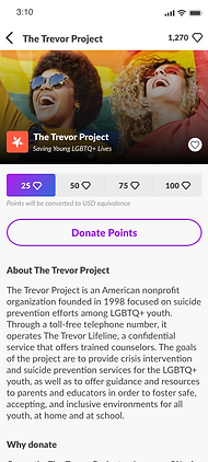
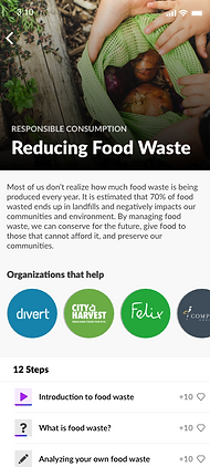
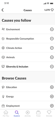
Users can discover through multiple entry points: interest, organization, cause, and curated collections.
Seamless navigation & progress
Linked causes, activities, and organizations plus resumable activities make exploration and completion easier.
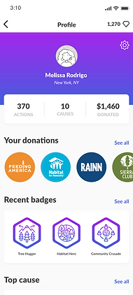
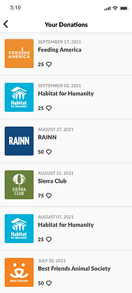
Clear impact visualization
Contributions are quantified and shown alongside global metrics, boosting motivation.
Deliver
In the delivery stage, I translated refined prototypes into a cohesive, polished final design. The result directly addressed the original challenges — limited activity discovery, weak connection to impact, and a disconnect between user actions and measurable results.
The final design focused on our earlier defined design objectives:
Discovery & Navigation
Improve findability with better search, personalized recommendations, and clearly defined categories.
Progress & Growth
Make it easy to resume activities, track progress, and view contributions.
Empower small actions
Highlight individual contributions alongside global impact to inspire motivation and action.
Unified relationships
Connect activities, causes, organizations, and donations into a cohesive system.
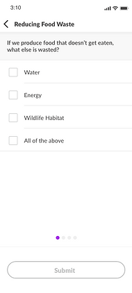
Find activities by followed organization
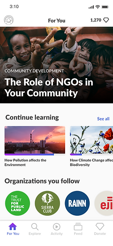
Recommended activities
Personalized recommendations

Find activities by interest


FINAL SCREENS


Reflect
Navigating the MPACT project underscored the importance of validating early and designing with constraints in mind. Limited direct user research and shifting business priorities required flexibility, rapid iteration, and strong alignment between user needs and business objectives. The process reinforced my commitment to grounding design in measurable impact and connecting every user action to a clear outcome.
CHALLENGES
SUCCESSES
Shifting business priorities
Company focus moved away from the redesign mid-process, slowing progress and delivery.
Limited user testing opportunity
Minimal access to users meant relying more on assumptions, increasing design risk.
Cohesive, logical UX
A unified, systematically structured experience that improved navigation, engagement, and overall usability.
Updated UI
A refreshed visual design that elevated appeal and better resonated with the target audience.
Thoughtful design approach
A user-centered process that produced a more impactful and meaningful platform.
Opportunities
01
Expanded user research
Conduct longitudinal studies to track retention, motivation, and behavior change over time.
02
Enhance impact metrics
Develop richer, more dynamic ways to track and visualize both individual and collective contributions.
03
Broader ecosystem integration
Explore strategic partnerships that embed MPACT into adjacent platforms to expand reach and relevance.